How to Read Crypto Charts and Spot Market Trends

Crypto charts are absolutely indispensable for any trader, painting a pretty clear picture of price shifts and uncovering the twists and turns of market trends.
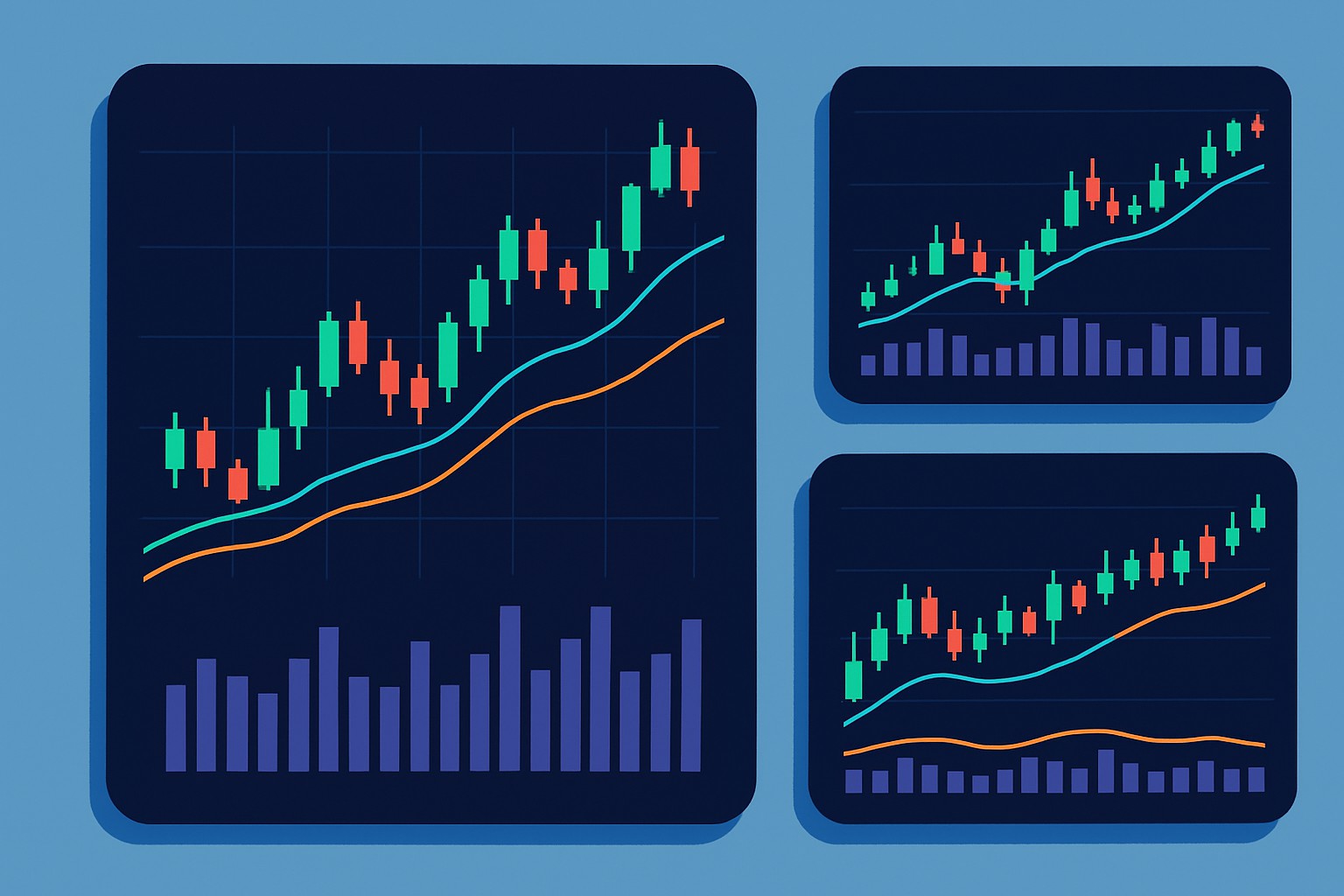
Getting to Know the Key Parts of Crypto Charts (Because Every Pixel Counts)
A crypto chart crams a surprising amount of info into a pretty small visual corner. The vertical axis typically lays out the price levels, while the horizontal axis ticks off the passing of time. Volume indicators show just how much of the asset has changed hands, giving you a sense of the market’s hustle and bustle.
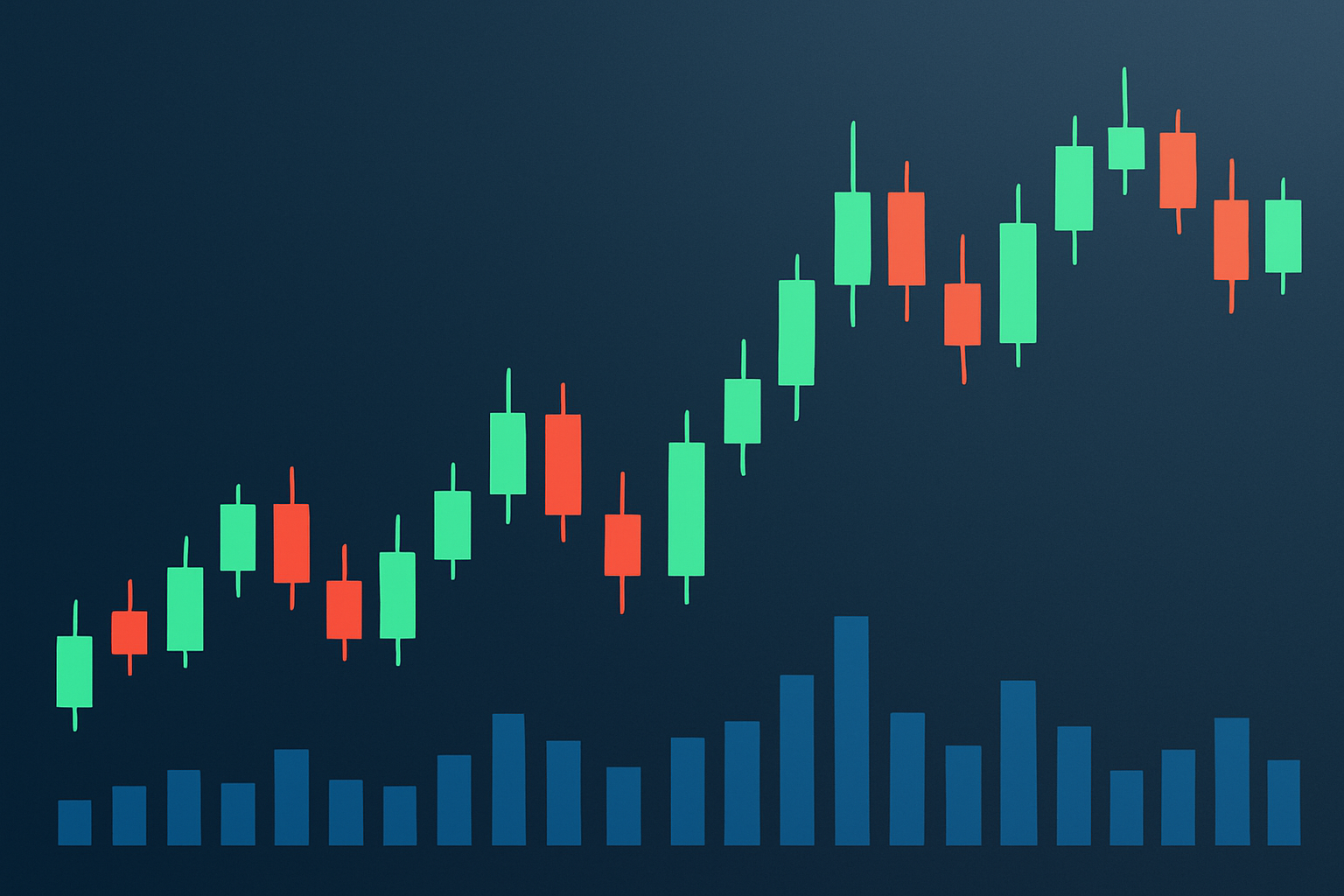
- Candlestick charts: These show open, close, high and low prices with green or red bars that capture the mood—bullish excitement or bearish caution. They’re like the mood ring of trading.
- Line charts: Connect the closing prices over time and give you a clean no-frills snapshot of the trend. Sometimes less is more.
- Bar charts: A close cousin to candlesticks that use bars to map the price range and offer another way to slice the data. Think of it as a slightly different flavor of the same basic idea.
- Time frames: Span from lightning-fast 1-minute intervals to daily views. Each fits snugly with different trading styles—there’s something for everyone.
- Volume bars: Sitting just below the main price chart these bars track trading activity levels and can be a handy sidekick in confirming those price moves you’re watching.
Step-by-Step Guide on Reading Crypto Charts (Because Numbers Don’t Have to Be Scary)
To get the hang of reading crypto charts you have to know what makes up those candlesticks and make sense of price movements. You also need to keep an eye on volume to confirm those moves.
Take a close look at the candle body and wick: The body shows the opening and closing prices while the wicks reveal the highest highs and lowest lows during the time frame—think of them as the candle’s little arms reaching out to tell a story.
Learn to spot the difference between bullish and bearish candles: Green ones usually signal prices moving upward while reds tend to flag declines.
Keep an eye out for volume spikes: When trading volume suddenly jumps it often backs up the strength of a price move like a cheer squad for the market.
Get familiar with common chart patterns such as consolidation, breakouts or reversals—they’re like the market’s way of dropping hints about possible trend changes.
Check multiple time frames: This wider perspective helps you dodge false signals by comparing trends across different periods. Like double-checking your directions before hitting the road.
Common Chart Patterns and What They Reveal (The Clues Hiding in Plain Sight)
Crypto markets often throw up familiar price patterns that hint at what could be coming down the pike. Patterns like head and shoulders or double tops and bottoms usually suggest a possible trend reversal, while flags and triangles tend to signal that the current trend might just keep on trucking.
- Head and Shoulders: This classic pattern often signals a reversal after an uptrend with three peaks lined up and the middle one standing tallest like the star of a slightly dramatic show.
- Double Top and Bottom: These patterns hint at reversal points where the price tests a level twice before changing course. Think of it as the market knocking on the same door twice before walking a different path.
- Ascending and Descending Triangles: These suggest breakouts are brewing as support and resistance lines inch closer, like tension building before the big reveal.
- Flags and Pennants: Short-lived pause patterns that appear before the current trend picks up speed again, like catching your breath before a sprint.
- Cup and Handle: A bullish formation resembling a bowl followed by a modest dip that sets the stage for a satisfying breakout. It’s like watching a tea cup tilt before the steam starts to soar.
How Technical Indicators Can Lend a Hand in Confirming Market Trends
Price patterns often give us a pretty good hint about where the market could be headed, but tossing in technical indicators adds that much-needed sprinkle of numerical confirmation. Moving Averages come in handy by smoothing out those wild price swings and making trends pop a bit clearer. The Relative Strength Index (RSI) keeps an eye on momentum, flagging when an asset might be running a little too hot or looking a bit under the weather. MACD mixes trend and momentum info in a neat little package, often spotlighting potential reversals or keeping you posted on ongoing moves.
| Indicator | What it Measures | How to Interpret | Example Use Case |
|---|---|---|---|
| Moving Average | The average price over a specific period | When the slope is heading up, it’s often a sign the market’s on the rise; if it’s sloping down, that usually points to a downtrend — pretty handy for spotting direction | Try applying 50-day and 200-day moving averages to get a clearer picture of long-term trends, a classic move that rarely disappoints |
| RSI | Momentum oscillator on a scale from 0 to 100 | Readings above 70 can mean the asset’s looking a bit overbought, while under 30 suggests it might be oversold — think of it as the market’s mood swings | Great for spotting potential reversal points, especially in markets that love to keep you on your toes with volatility |
| MACD | The difference between two exponential moving averages | When the signal line gets crossed, it’s often a subtle heads-up about a momentum shift, a nudge you don’t want to miss | Pair it with price breakouts to boost your confidence in buy or sell decisions — a trusty combo in my experience |
Practical Advice for Spotting Market Trends in Crypto Trading Without Magic
Strong price moves backed by hefty volume usually carry more weight and are worth trusting a bit more.
Piece together how those short-term price swings fit snugly within the bigger, long-haul trends.
They’re often the early whispers of brand-new trends kicking off or signals that old ones are packing up.
Give your trade signals that extra punch of credibility.
Stick firmly to your analysis rules, steering clear of those tempting snap decisions that often lead you astray.
New traders often stumble by jumping on every little price twitch without stepping back to see the bigger picture, or by ignoring important clues like volume when learning how to read crypto charts. Leaning too heavily on just one indicator or a single candle pattern without sizing up the whole market usually ends up leading to some regrettable trades.
- Overtrading usually creeps in when traders get jumpy over tiny price moves instead of focusing on bigger trends.
- Ignoring volume data is often the secret sauce for figuring out if price shifts are real or just noise.
- Relying solely on a single technical indicator without cross-checking other signals reduces confidence.
- Misreading candle patterns, especially when viewed in isolation, misses the broader market context.
- Overlooking important market news can throw a major wrench into price movements if you are not paying attention.

Start Your Crypto Journey with Coinbase Today
Ready to enter the cryptocurrency market but unsure where to begin? Coinbase makes buying, selling, and storing digital assets simple and secure for beginners and experts alike.